3 Types of Heatmaps to Track Customers in Physical Locations

As mentioned in the earlier article, heatmap is one of the useful location analytics tools to understand the in-store customer journey – it visualizes which parts of your store are more popular than others using footfall data. There are basically 3 types of heatmaps in retail industry for measuring different aspects of customer behavior, including crowd counts, dwell time and overall traffic. An example using footfall data from a bookstore in Europe is shown below as a demonstration.
Let’s Begin…
Before compiling a heatmap, we need to determine its resolution which best suits our needs. First, the store is divided into a number of squares such that each square represents a sub-region with size of 0.5m x 0.5m, i.e. every step of the customers can be tracked. Then, we need to choose a time range such that only data generated within the period are included in the analysis. Like adjusting the exposure time of a camera while taking pictures, a short time range can provide a sharper heatmap and provide instant information about customer behaviors. However, a sufficiently large sample size (i.e. higher crowd count) is needed in this case or the heatmap cannot reveal reliable information in terms of relative hotness of the heatmap. On the other hand, a long time range has the advantage of including more data points and hence give us a stabler and more accurate analysis. In our example, we choose a time range of one day with total crowd count of 816.

Pros and cons using different time ranges
Crowd Count Heatmap
The crowd count heatmap is the most intuitive type and is the easiest to interpret compared with other heatmaps. The number of people appeared in each sub-region is counted within a defined time range and represented by the color of each square in a way that the more people detected in a particular sub-region, the hotter (deeper in color) the corresponding square will be. In this example, you can see that the areas selling non-fiction books and toys are the hottest among the store and there are also quite a lot of people appeared in front of the cashier. However, by just looking at the crowd count heatmap we do not know if they stay in those areas or just pass through while planning to go somewhere else.

Daily crowd count distribution
Dwell Time (Median) Heatmap
To know if customers are more likely to stay in some areas, the dwell time heatmap would be a good choice to reveal this information in which the crowd count heatmap cannot provide. For the dwell time heatmap, the hotness indicates how long customers stay if they appear in a particular place. The median instead of average of dwell time is calculated to avoid effect of outliers contributed by hot devices (e.g. staff/computers staying in particular areas on purpose). In this example, the amount of time in which the customers spend on is evenly distributed inside the store, except two hot spots – near the entrance and in front of the back office, where magazines and postcards are displayed. It tells that even though not many customers pass through those areas, they generally spend more time on looking at those products and are more engaged. However, this heatmap cannot provide information about the crowd density so that a spot can be very hot for the case when there are only very few people and all of them spend a long time in a particular area.
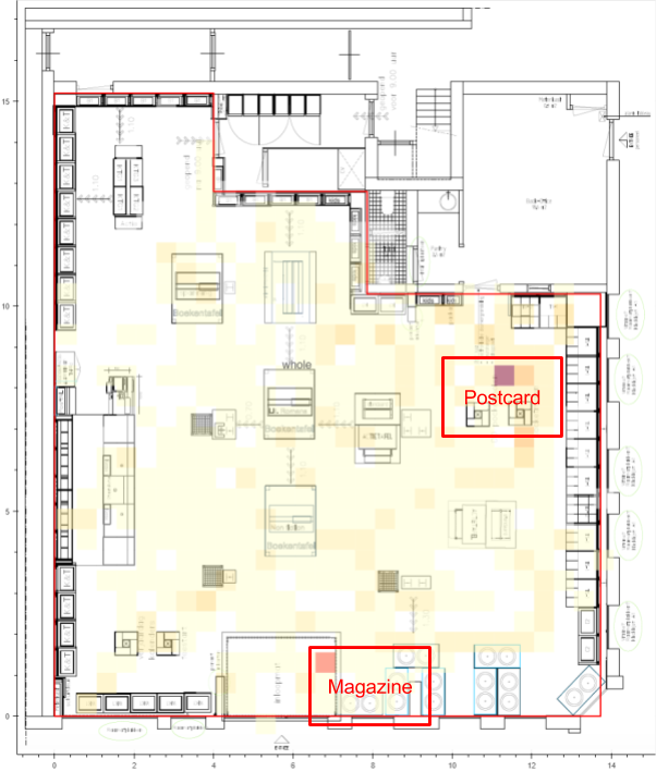
Median customer dwell time distribution
Why Are Crowd Count and Dwell Time Heatmap Seem Telling Us Different Stories?
Depending on the attributes of the products you are selling, the crowd count and dwell time of the corresponding areas can be varied much. There is no absolute guidelines on how hot or cold a spot should be in terms of these dimensions but the rule of thumb here is to pay attention to the two extreme cases – reduce the amount of unpopular or outdated products since they cannot fully utilized the space and consider implementation of crowd management when dwell time and count are too high.
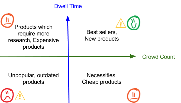
Different combinations of crowd count and dwell time
Overall Traffic Heatmap – the Aggregate of Crowd Count and Dwell Time Heatmap
The overall traffic heatmap is the most commonly used kind of heatmap in location analytics for retail industry which measures to what extend an area is occupied within a certain period of time. This heatmap is the most comprehensive among the 3 and can provide a full picture of occupancy inside a store. However, it is less intuitive as the hotness is calculated by adding up all the dwell time of customers appeared in a certain area during the a specific time period such that the longer the total dwell time, the hotter the area is. This kind of heatmap can also be used by the management team to make decisions of how crowd management should be done. For the bookstore case below, it is seen that the overall traffic in front of the cashier is much higher than other parts of the store, which suggests that some measures may need to be taken to smoothen the crowd traffic there, like by allocating more staff to handle transactions. Like other heatmaps, this is not a perfect solution as some information may be lost while compiling the heatmap. For example, one device spending an hour in a zone will be indicated by the same hotness as two devices each spending 30 minutes in the same zone, which may lead to confusions of the true customer behaviors. Hence, it is encouraged to look at all the 3 kinds of heatmaps at the same time before making any business decisions.
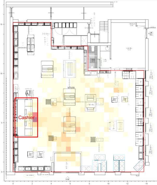
Daily total area-occupied time distribution
Limitations of Heatmaps
Although heatmaps are powerful in visualizing customer behaviors within a certain period of time, there are still limitations in seeing the whole customer journey – where do the customers go first and plan to go next. Details about path analysis will be discussed in the coming article.